Why Develop Responsive App Interfaces with Flutter Framework?
The leading trend for mobile app design, which has stayed longer than others, is UX-led designs. You want to ensure your user remains in the app longer and converts into your customer (and later brand advocate). When you design your product for the user, it helps unleash frictionless usability and accessibility across devices.
In the case of eCommerce applications, at least 70% of the shoppers admit to abandoning carts because of fractioned experiences (Red Signal). Owing to poor UX, 25% of the mobile apps are removed after a single use (TechCrunch).
When you talk of a cross-platform solution, you need to ensure it is an OS-agnostic and Device-agnostic experience. You can ably include that in your design and strategy by including responsive designs.
Let’s take a quick look at some of the advantages of using Flutter responsive Layout designs.
Why Responsive Interface for Flutter Apps?
You are developing a Flutter app that works across all operating systems. With the ever-evolving devices for Android and iOS, your app must work across styles, sizes, and form factors.
- You are not just looking for an app that will work across platforms; you are also looking for something consistent and uniform on all devices.
- When you offer uniformity, it also extends your retention rate. When people feel good about using your app, they will stay longer and not delete the app.
- You will also deliver a web app solution with Flutter, and your experience should be similar on the web. Responsive design slices the app design to make sure it doesn’t break the pattern on the web.
- Most mobile apps improve their engagement and conversion rate when they invest in user experience and, more importantly, uniform designs. You can get both when you deliver responsive and highly incredible design solutions.
How do Android and iOS Differ in their Responsive Approaches?
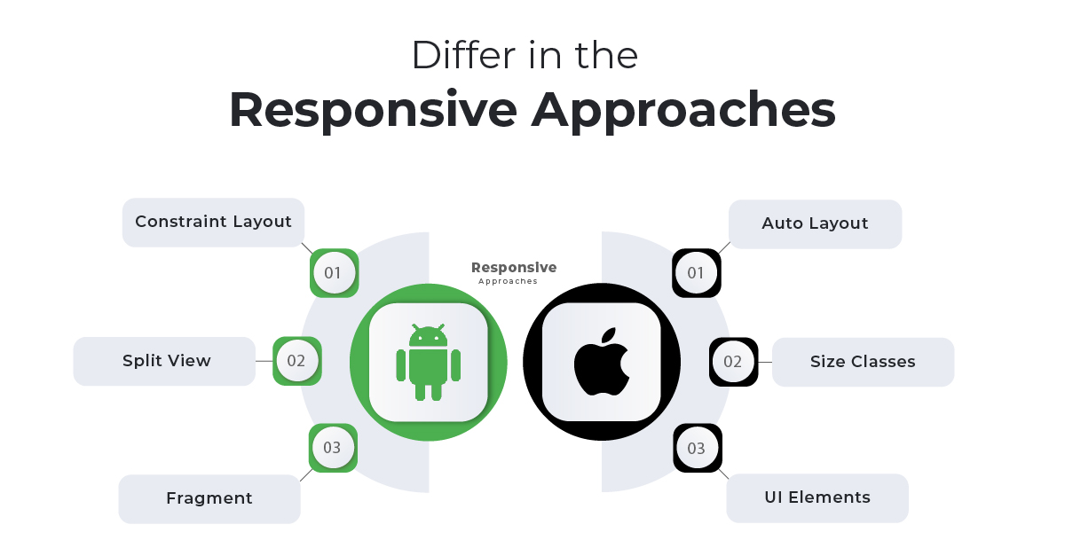
The two operating systems, iOS and Android, handle Flutter responsive UI designs differently. The reason is they are both unique systems as far as design and interfaces and device fragmentation are concerned.
Here, we will take you through the individual OS approach that you need to take.

The Android Way
Android has four aspects that you need to consider when delivering a responsive design.
- ConstraintLayout: When you are creating an interface for Android, you are dealing with multiple systems, sizes, and dimensions. You need to make sure that your interface is flexible for that purpose. This function in your code will allow you to create uniform and flexible UI
- SplitView: Your layout will change as per the screen, as we just discussed. This splitview will allow the code to make the requisite adjustments to the layout without causing friction.
- Fragment: The Android platform is fragmented in nature. With this, you will be able to segment the UI logic into components, thus saving efforts to create different logic.
- VectorDrawable: If you add images or graphics, you will need this inclusion.
The iOS Way
When coding for the iOS platform, the following inclusions are essential to make the interface flexible and the layout scalable.
- Auto Layout: This works in the same way constraintlayout does for Android. It helps adjust the layout to suit the size and form factor of the device so that it doesn’t hinder usability.
- Size Classes: It helps make the layout adjustments by defining the size classes along with the content spaces
- UI Elements: You will need to use elements such as UIStackView, UIViewController, UISplitViewController to develop the responsive interfaces for your application on iOS
Imagine sitting and working on these classes individually so that you can launch your app on the store as early as possible. It will require a lot of resources, the proper infrastructure, and time. You are short of everything, considering you want to make it to the market at the earliest.
That’s why you should use Flutter to build your responsive interface. It will make the whole process of responsive layout easy and hassle-free.
Flutter Responsive UI Development Steps
When you are building responsive interfaces, there are two things you need to consider:
- How will the code know the screen size and what function to use for the code?
- How will the layout adapt to the new screen size?
The Flutter documentation comes with these options that allow you to code the screen size and make the layout responsive.
MediaQuery
When your app needs information on the screen size and orientation, you can use this option in your code. It offers complete data that allows you to help the app know what layout to use at the moment.
It will provide inputs into the orientation, screen type, and size.
This is the code for MediaQuery.
MediaQueryData mediaQueryData = MediaQuery.of(context);
For example, you have set the menu design. Now, use MediaQuery in your code so that the app will know if it has to move the menu to landscape or portrait.
In this case, the menu is your detail page. Once the detail page opens, every element in the menu item needs to be detailed in the child widget. So, you will mention every item on the menu.
Once you are done, you will need to add the SafeArea function to your widget so that the app pulls it.
This safe area needs to be separately mentioned for vertical and horizontal orientations.
Here is an example code for your reference
DisplayType getDeviceScreenType(MediaQueryData mediaQuery) {
var orientation = mediaQueryData.orientation;
double deviceWidth = 0;
if (orientation == Orientation.landscape) {
deviceWidth = mediaQueryData.size.height;
} else {
deviceWidth = mediaQueryData.size.width;
}
if (deviceWidth > 950) {
return DisplayType.Desktop;
}
if (deviceWidth > 600) {
return DisplayType.Tablet;
}
return DisplayType.Mobile;
}
What is a safe area?
It is the function that helps control the orientation or the mode in the MediaQuery. It ensures that the app stays in that mode once the safe area value is returned.
LayoutBuilder
This is the second most crucial function that allows you to keep the layout flexible. If you don’t want to use MediaQuery, you can opt for LayoutBuilder. It builds several widgets that help maintain the size and orientation of your application layout. You can use the builder to specify the height and width of the screen so that the layouts can be transformed accordingly.
- This option begins with the Safe Area. You need to declare the layout safe.
- You will then need to specify if the detailed page (menu items) uses the same width as the menu.
- If you have added a detail page (say a menu page), you will need to specify the child items (the links added to the menu)
If you don’t have a menu bar but just the menu items, you will show them as lists. For this, you will use a different function.
Using the following code, you can build the necessary widget for the particular class or item.
Widget build(BuildContext context) {
return Scaffold(
body: LayoutBuilder(
builder: (BuildContext context, BoxConstraints constraints) {
if (constraints.maxWidth > 600) {
return _buildWideContainers();
} else {
return _buildNormalContainer();
}
},
),
);
}
If you want the layout to be more expanded and flexible, you might have to specify it in your code. For example, do you want it to be displayed as a row or a column? If you specify it, the code will pull the layout accordingly.
For expanded widget
const Expanded(
{Key? key,
int flex = 1,
required Widget child}
)
For a flexible widget
const Expanded(
{Key? key,
int flex = 1,
required Widget child}
)
Aspect Ratio
This is another widget that helps you resize the layout to meet the device's requirements. in this case, the widget will take the largest width as the base and then move on to smaller widths with constraints. You can use the aspect ratio to determine the height of this widget.
You have managed to resize the layout and reimagine the orientation. It is now important to make the necessary adjustments so that it appears the same across devices.
#1. Auto Resizing
With MediaQuery and LayoutBuilder, you will be able to transform the size and orientation. However, you will need to make the requisite changes to the text on the screen. For this, you need the widget for auto-resizing.
The FittedBox is the best widget to resize the child components to match the parent layout. It will help ensure that all elements on a particular screen are correctly fitted.
- Your FittedBox should be the parent widget for the text that you need to alter.
- Now, you should use BoxFit Contain so that you can fit in the text and scale it to any size required.
- Your text widget will become the child in this case.
As soon as you follow the screen orientation code with this widget, you will notice that the text is altered to suit the layout design.
#2. CustomMultiChildLayout
This is the second widget you can use with Flutter to resize your layout to a fraction of the available space. It is a pre-calculated layout size. You can use it with the expandable and flexible widgets that we discussed when we discussed the layout builder
- Start your coding by declaring the subclass for MultiChildLayoutDelegate.
- You will use the widgets LayoutChild and PositionChild to perform the layout method.
- You will need to associate a Boolean value to the ShouldRelayOut in case you want the widget to change the layout.
How Flutter Makes Responsive Design Easy?
You went through complete documentation for changing layouts and making the interface flexible. If you don’t want to use the widget method, you can always use the responsive design packages with Flutter.
The community and its collaborative efforts have allowed developers to use ready-to-design packages such as FlutterScreenUtil and ResponsiveSizer that will enable you to design layouts without hassles.
- When coding the screen sizes, make sure not to hardcode when using these packages
- The first step is to code the dimensions and then install the package
- You can use the design widget in this package. You also use include the extensions library as and when you need
- Make the necessary screen size and orientation coding changes as per the new functions for the design packages
Once done, you will be ready with flexible and responsive flutter layouts.
Conclusion
A responsive app can help you gain maximum traction and improve retention. However, when you are designing an app for both iOS and Android platforms, it becomes difficult to manage the separate approaches. You may not get a clean interface the first time.
Designing with Flutter makes it easy. there are widgets and options that allow you to incorporate the responsive build easily. You can also use the design packages to make the process swift.
 Jignen Pandya


