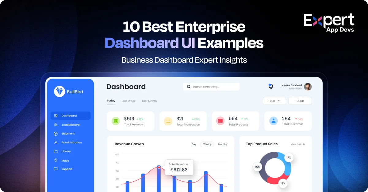
Top 10 Real-World Dashboard UI Design Examples for Enterprise Applications
Imagine a situation where your team is experiencing a data overload. But, as there isn’t enough clarity on what to make from the data, decisions are getting delayed and the decision makers are frustrated. So, what’s missing?
A well-structured and intuitive dashboard that provides visuals to uplift your strategy. The strong interfaces will showcase actionable insights attained from complex data in a visually appealing manner.
They speed up decisions by 35% while ensuring cross-departmental alignment. Additionally, the modular designs can ensure maximum scalability for your business.
This guide will take you through the top 10 real-world enterprise dashboard examples that look excellent and solve real-world business problems.
Why Great Dashboards Are a Strategic Imperative?
As a business, your biggest threat is the enterprise data explosion. Most businesses rely on static charts to get some understanding of the data, but as information evolves, you need more than just charts. You need clarity with solutions that enhance decision-making while making way for opportunities.
That’s where the modern enterprise dashboard can help. With role-based interfaces and dynamic solutions, your user will get the information that matters most to them. These dashboards are designed for the users, which makes them more than a reporting tool. As a strategic asset with well-designed dashboards, they help you attain insights faster, align the priorities, and ensure maximum precision.
With enterprises in the USA, UK, Canada, Australia, and the Middle East regions vying to stay competitive in the local and global markets, it has become important to deliver such dashboards. Using the right dashboard, they can improve operational ROI while minimizing the insight delivery time. Eventually, it will help your teams make smarter decisions on time to deliver maximum value to the business.
In short, you can use dashboards to visualize data and translate it into action. If your enterprise applications don’t have a strategic dashboard design, you are not just lacking design but also on important business strategies.
The Anatomy of an Enterprise Dashboard Examples
What sets the high-performance dashboard apart from others? Here are a few core elements that make your dashboard functional and impactful. Let’s understand them in detail.

#1. User-Centricity: Tailored KPIs by role (CFO vs CEO vs Ops)
When all your users don’t consume data the same way, why would you want to serve them with the same dashboard? The CFO of your company will be looking at the financial forecasts, while the COO will prioritize operational efficiency data.
By incorporating high-performance dashboard ideas, you can prioritize user-centric dashboards that help tailor the KPIs to the specific roles. This would increase personalization and relevance, thus ensuring usability, better decision-making, and reduced cognitive load.
Aligning the dashboards with the user’s goals, you can empower your teams to act confidently. With user-specific views, you can drive real value for your users. This is an important element of an enterprise dashboard design.
#2. Clarity & Simplicity: Eliminate clutter, emphasize whitespace
A cluttered dashboard poses a wasted opportunity for your business. An effective dashboard, on the other hand, simplifies all your complex data and includes whitespace that guides your eyes, thus reducing overwhelm.
With the clean and clear design, your users can scan the information easily and understand the relationship between different metrics. It can help them figure out priorities for the business.
Simplicity is no longer an aesthetic inclusion; it is an important strategic element that boosts speed and clarity. When you design the dashboard for clarity, it helps decision makers gather insights without distractions.
#3. Visual Hierarchy: Scan-friendly layouts
You have a few seconds to make an impression on your users with the dashboard. Using a strong visual hierarchy, you can ensure that the users find the most critical data first. Most high-performing dashboards are likely to use contrast, positioning, and size to guide your viewer’s eyes.
You can group relevant data and place the most important metrics for the user at prominent positions on the dashboard for a better view. This can make the dashboard scan-friendly as well.
This will help the executives and different teams get the key insights at a glance and enable smarter decisions quickly.
#4. Actionability: Drive insights from data, not just reports
When you don’t provide your data with proper direction, it ends up being a lot of noise. Actionable dashboards are more than just simple reporting; they provide insights that prompt key decision-makers to take action.
Your users will get detailed trends, anomalies, and even quick comparisons that highlight what is working for the business and what’s not. There are interactive elements as well, like filters and drill-downs, that help understand the purpose and reason behind a particular number and insight.
With time criticality, it has become important for users to act immediately instead of observing the data or the noise. When you enable a great dashboard design, you ensure that every metric serves a particular purpose for your business and stays aligned with the strategy.
#5. Real-Time Responsiveness: Always up-to-date
As the world is dynamic, data needs to evolve and change continuously. You cannot use yesterday’s data to make decisions today. With real-time responsive dashboards, you will get a view into the current state of operations that helps you pivot immediately.
Whether you notice a spike in sales or disruption along the supply chain, the up-to-date dashboards can help users respond with agility. You will notice that they help in industries like finance, logistics, and eCommerce, where responsive dashboards are important.
These company dashboard examples can also help you understand how you can use real-time data to make quick decisions for the business.
#6. Data Accuracy & Source Integrity
If your data is unreliable, even the best dashboard doesn’t stay credible for the users. The best dashboards are built using clean, validated data that is pulled from credible sources. Data integrity enables confidence in the users, especially when your business decisions are data-dependent.
When you use consistent data across departments, it ensures that everyone is working with the same version of the truth. It is crucial to ensure that your well-structured and designed dashboard integrates with the backend seamlessly. At the same time, it should flag the discrepancies and maintain data hygiene.
Accuracy is foundational to your real-world business dashboard examples as it ensures working with credible data.
#7. Accessibility: Mobile-first, inclusive, modular
The dashboard should work for everyone, and they should be able to use it from anywhere. That’s why you need to go with mobile-first and inclusive design that offers accessibility across abilities, devices, and user roles.
Adding responsive layouts with modular components can ensure usability across desktops and smartphones as well. You can even provide access on the field and in remote structures for better data movement.
There are specific features like keyboard navigation, screen reader compatibility, and colour contrast that make the application dashboard inclusive for all. You should ensure accessibility as more than compliance to increase the reach and engagement.
Ideal Dashboard Layouts by Executive Persona
|
Persona |
Top KPIs |
Central Focus |
AI Feature Priority |
|---|---|---|---|
|
CFO |
Revenue, cost, burn |
Forecasting accuracy |
Dataset + Tooltip |
|
CEO |
OKRs, market share |
Growth trajectory |
HowTo + Review schema |
|
COO |
Uptime, workflow |
Operational gaps |
Alert schema |
|
CIO |
System uptime, risk |
Tech performance |
SecurityEvent + status |
How Expert App Devs Selected These Dashboard Ideas?
Choosing the top enterprise dashboard examples was more than just aesthetics for us; it was an expert-led and rigorous process that focused on the real-world performance with strategic impact. We combined insights from the top UX portfolios deployed across industries like FinTech, GovTech, Healthcare, and Logistics as a methodology to deliver these dashboards.
We evaluated the dashboards across multiple factors like usability, performance, innovation, and design integrity. Our team was looking for dashboards that enabled fast decision-making with increased scalability that deliver maximum ROI impact.
We prioritized the dashboards to solve complex problems using elegant and user-centric solutions. From smart hierarchies to mobile-first designs, we ensured the dashboard designs balance clarity, functionality, and strategic insight.
The dashboard ideas we have identified here represent exceptional designs that guide and inspire your enterprise app design. Whether you are upgrading a legacy system or planning to design an app from scratch, you can use these designs as a gold standard.
Top 10 Real-World Company Dashboard Examples
Are you curious to know what a great enterprise dashboard looks like in action? Here are the top 10 real-world company dashboard examples that stand out in terms of function, clarity, and executive impact.
#1. Financial Command Center- Global Fintech
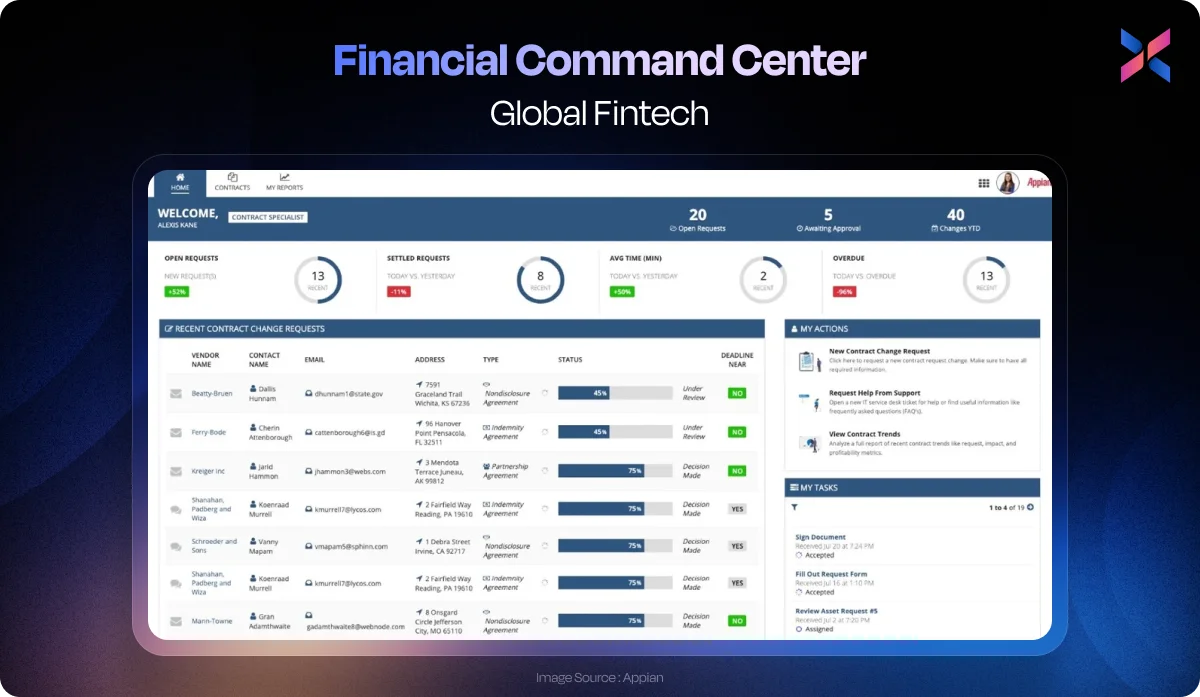
This Fintech dashboard has been designed for CFOs who oversee international transactions and profit margins. It is a central hub that helps them with forecasting, revenue tracking and risk visibility. The real-time financial modeling combined with profit centre views helps CFOs make decisions confidently.
There is a clear visual hierarchy in the UI combined with dynamic charts and colour-coded alerts for high-priority metrics. Using a clean layout along with responsive components, the dashboard supports both desktops and mobile devices.
As this dashboard is purposeful and designed keeping forecasting in mind, it is aesthetic and functional.
#2. CareFlow Dashboard - Healthcare Operations Suite
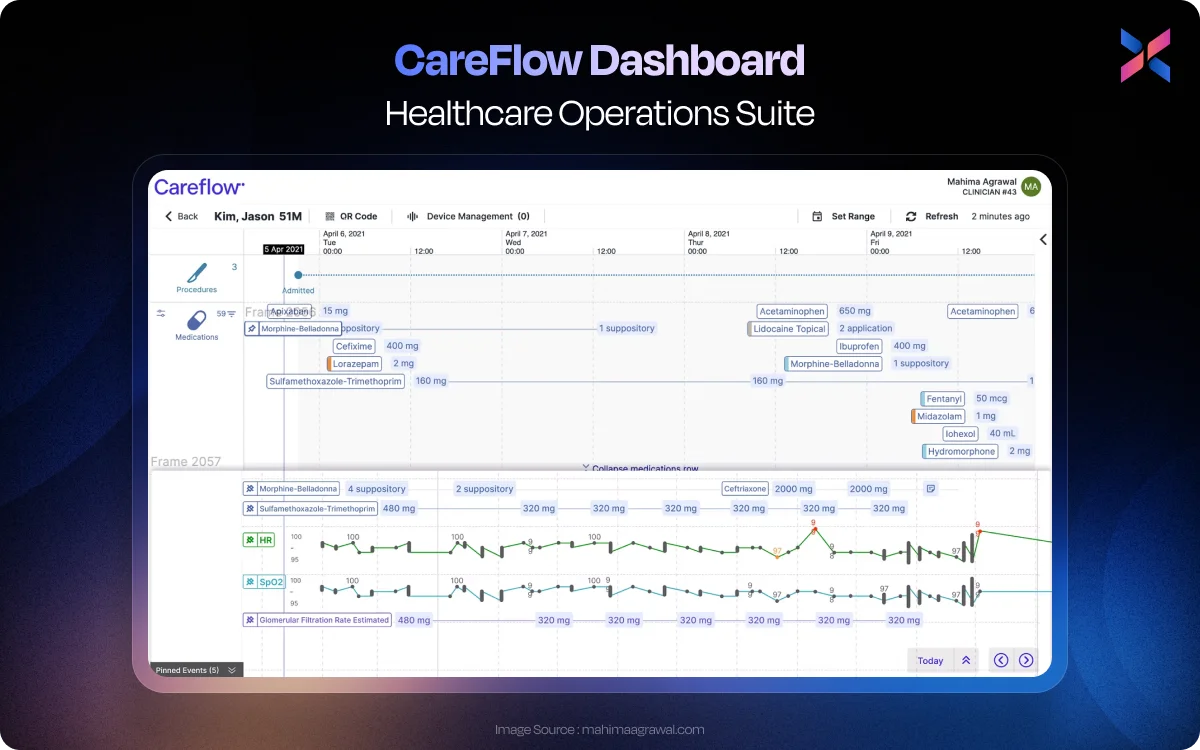
The dashboard is designed for hospital administrators and clinical leads, prioritizing real-time patient load balancing and staff resource management. Using this dashboard, you can reduce wait time, reduce burnout and improve patient outcomes.
The design patterns include heatmaps for ward occupancy, role-based views for different users, like nurses and supervisors. You can get a clean and modular layout that improves the at-a-glance clarity even during peak traffic hours.
This dashboard design will work because it connects staff capacity with real-time patient demand.
#3. LogiTrack Dashboard - Real-time Supply Chain Monitoring
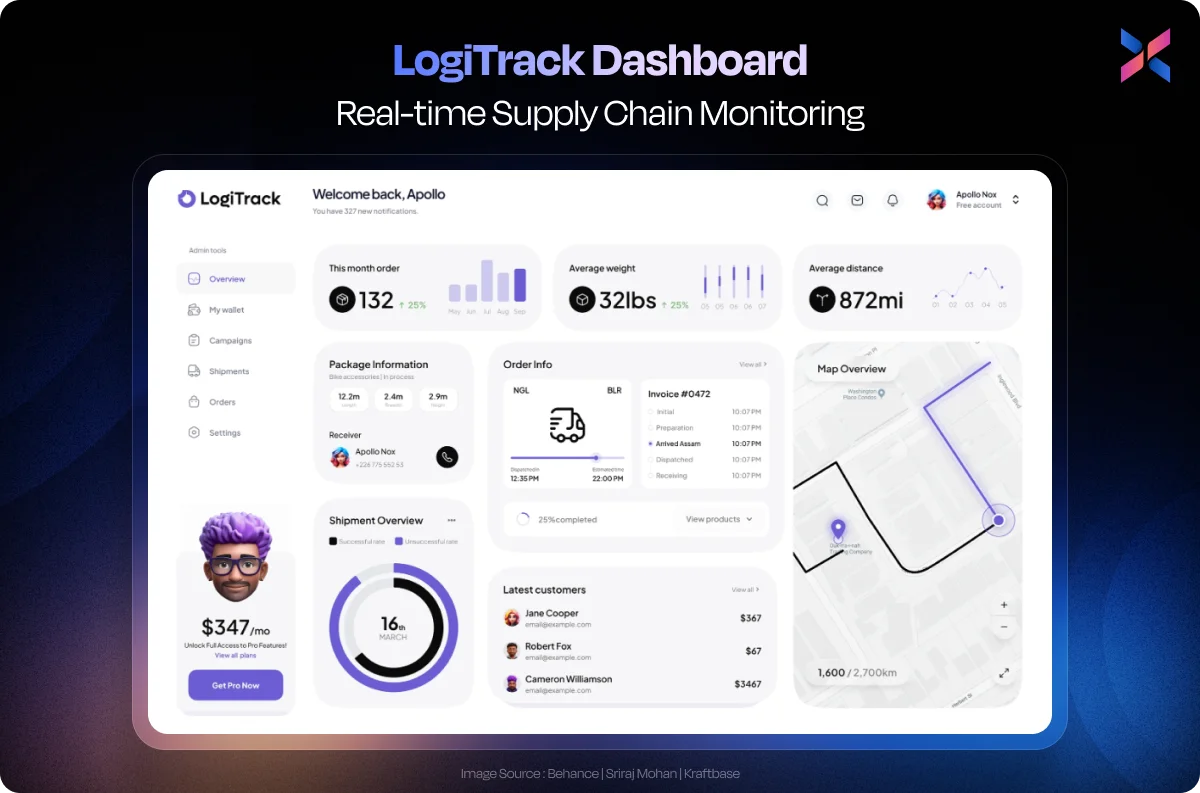
This dashboard is created for supply chain managers and the logistics director. This dashboard provides a live view into shipments, inventory levels, and transit disruptions across global routes. This framework helps with time-sensitive decisions, removing the guesswork.
Using geolocation mapping, performance indicators, and timeline-based alerts, you can deliver UI with SLA adherence and route efficiency. You can adapt to different screens, like control rooms and mobile tablets to ensure 24/7 sync between teams.
You will be able to transform complex supply chains into a visual command center with this dashboard. It uses real-time signals and intuitive maps to ensure smooth logistics.
#4. Retention Radar - SaaS Churn & Subscription Health Dashboard
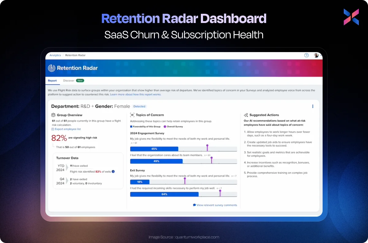
This is one of the leading enterprise dashboard examples, specifically designed for SaaS product managers and the customer success teams. Using this UI, you can focus on churn and monitor the health of the subscription lifecycle. With this dashboard, you get a proactive edge to flag risks.
It integrates behavioural analytics, usage patterns, and NPS scores to create a card-based and sleek interface design. With the predictive scoring models, you can segment the customer cohorts while ensuring perfect visualization.
It works because you get turn customer signals into actionable insights that help you note what is churning and how to prevent it.
#5. RetailPulse - Sales Conversion & Footfall Analytics Dashboard
This dashboard has been created for the managers of retail chains and their marketing heads. Users can visualize the footfall within the stores, the conversions, and even campaign ROI from a single interface. This user interface helps bridge the gap between in-store traffic and revenue performance.
You will find real-time heatmaps for the different zones in the store, the conversion graphs by the hour, and the promotion impact widget. It comes with a mobile-centred layout and multi-store filters that allow the managers to make location-specific decisions.
With this dashboard, several retailers notice a 25% increase in conversion efficiency with optimized staff and layouts. It works because the managers get complete visibility into the store’s performance with actionable insights.
#6. CivicSync - Government Service Efficiency Dashboard
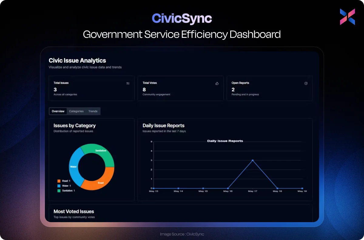
Built for municipal administrators and public sector users, this dashboard tracks all the service delivery metrics, such as permit approvals, response time, and citizen complaints. The goal of this interface design is to offer complete transparency and accountability that improves real-time operational efficiency.
The key design elements include colour-coded performance indicators, service-specific interactive maps, and citizen satisfaction trends. It is designed for the end users while balancing simplicity with admin depth.
With this dashboard, you can turn public service data into performance insights that are designed for speed and transparency.
#7. NetPulse - Telecom Infrastructure Load & Downtime Triggers
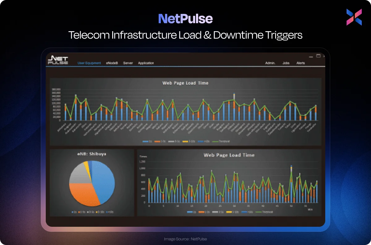
This is a dashboard specifically designed for telecom network engineers and operations that helps monitor infrastructure load, uptime, and real-time fault detection. Your users can focus on early alerts with service continuity that reduce expensive outages.
This interface design uses node-based network visualizations with a heatmap for load balancing that ensures downtime triggers. You get a layered access view for the executive and tech team that offers strategic oversight.
It provides a simple, readable, and responsive network status using complex infrastructure.
#8. TalentMetrics - Workforce KPIs & Hiring Funnel Dashboard
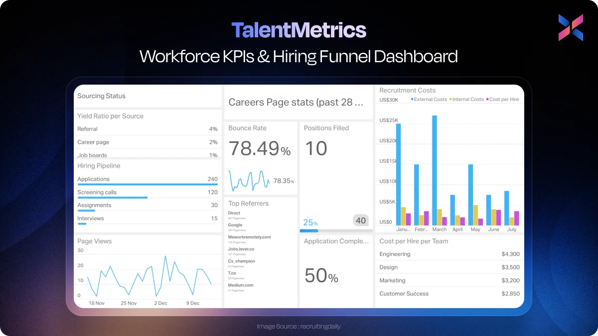
This is a dashboard designed for HR leaders and recruitment managers to help them track workforce performance and manage hiring efficiency. It also provides a detailed and unified view of employee engagement metrics. With this tool, the HR team aligns their recruitments with growth and retention goals.
Using funnel visualizations for attrition trends, DEO metrics, and different hiring stages, you get a clean and role-specific layout. The managers can filter the entire dashboard by tenure and department to get insights immediately. As it prioritizes people pipeline and long-term workforce health, it improves hiring cycle and onboarding success rates.
#9. EduFlow - Course Enrollment & Engagement
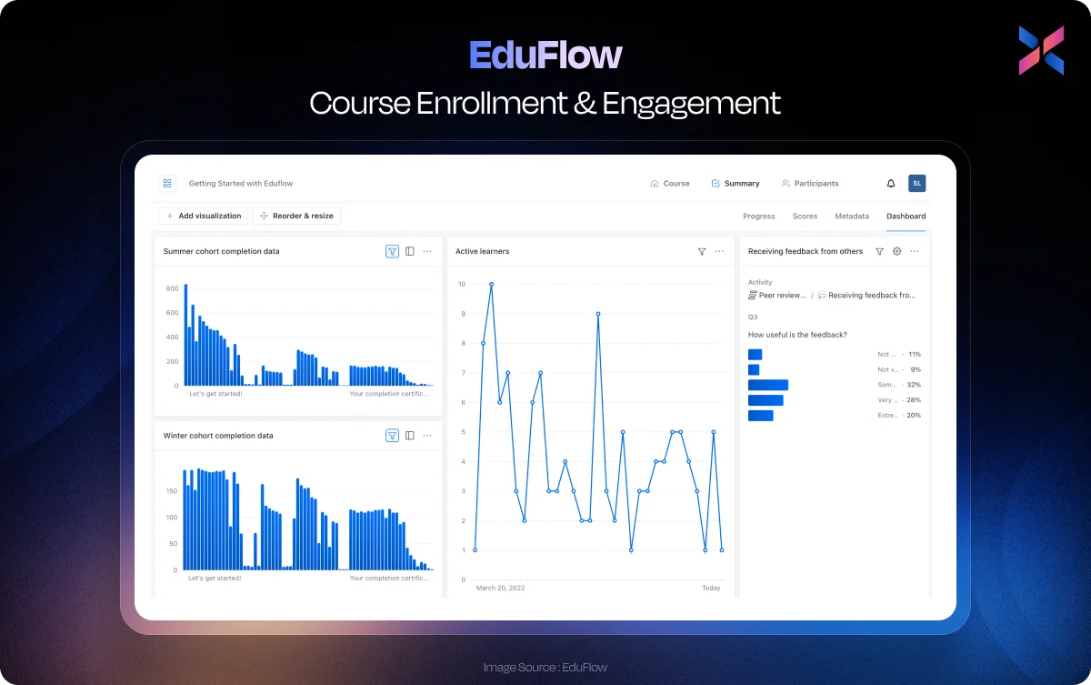
This education industry-specific dashboard was designed for the academic admin and program coordinators. It helps monitor the enrollment trends, performance of a course, and the student’s engagement. This dashboard optimizes your ability to plan the curriculum and boost the learner’s success.
You will get semester-by-semester enrollment graphs, engagement heatmaps in real-time and indicators for drop-out risks. The role-based access personalizes the data and delivers custom insights for the specific stakeholder.
#10. Smart Factory Command Centre - IoT Monitoring + Defect Prediction
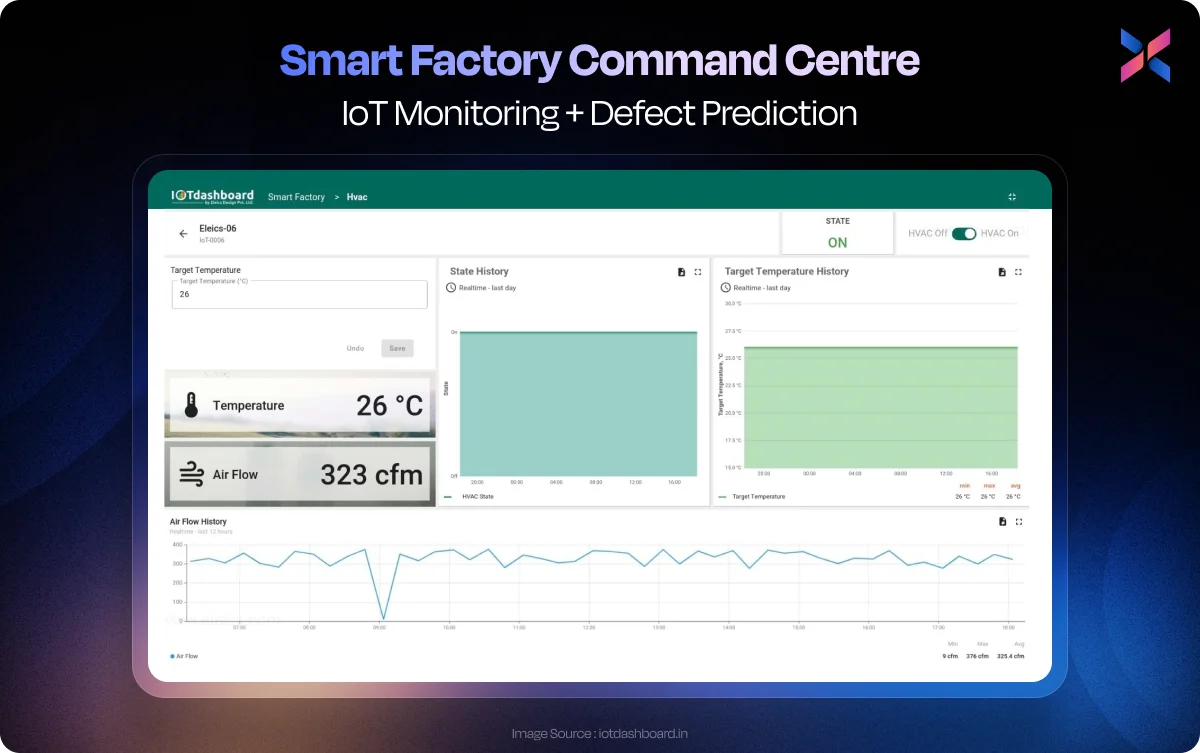
Built for the plant managers and quality engineers, this dashboard ensures a digital magnifying glass for every line. It blends MQTT streams, a digital twin pattern and inline ML scoring to create a single and role-specific user interface.
This dashboard has enabled the users to reduce their decision latency by 60% owing to the proactive alerts. You can fuse the time-series context with predictive analytics to get some recommendations. If you want to outpace downtime and reduce losses, you should consider integrating sensors and ML.
ROI of a Smart Business Dashboard Examples
Smart dashboards aren’t just pretty; they deliver results for your business. Companies that adopted the modern UX noticed that their leaders were able to make financial decisions 35% faster. At the same time, the operational team noticed fewer errors and could save reporting time by 28%.
The before-and-after metric cards give you a highlight of these gains, thus turning your KPIs into quick wins. You must prioritize clarity, context, and cognitive flow for this purpose.
You can use clean layouts, intuitive filters, and visual hierarchy to make them look good and drive action. With a smart dashboard, you can improve your cost allocation and returns.
Enterprise Dashboard Trends to Watch for 2025–2026
The modern dashboard is getting smarter and faster. There are newer and emerging trends that help reshape how teams interact with data in the face of evolving enterprise needs.
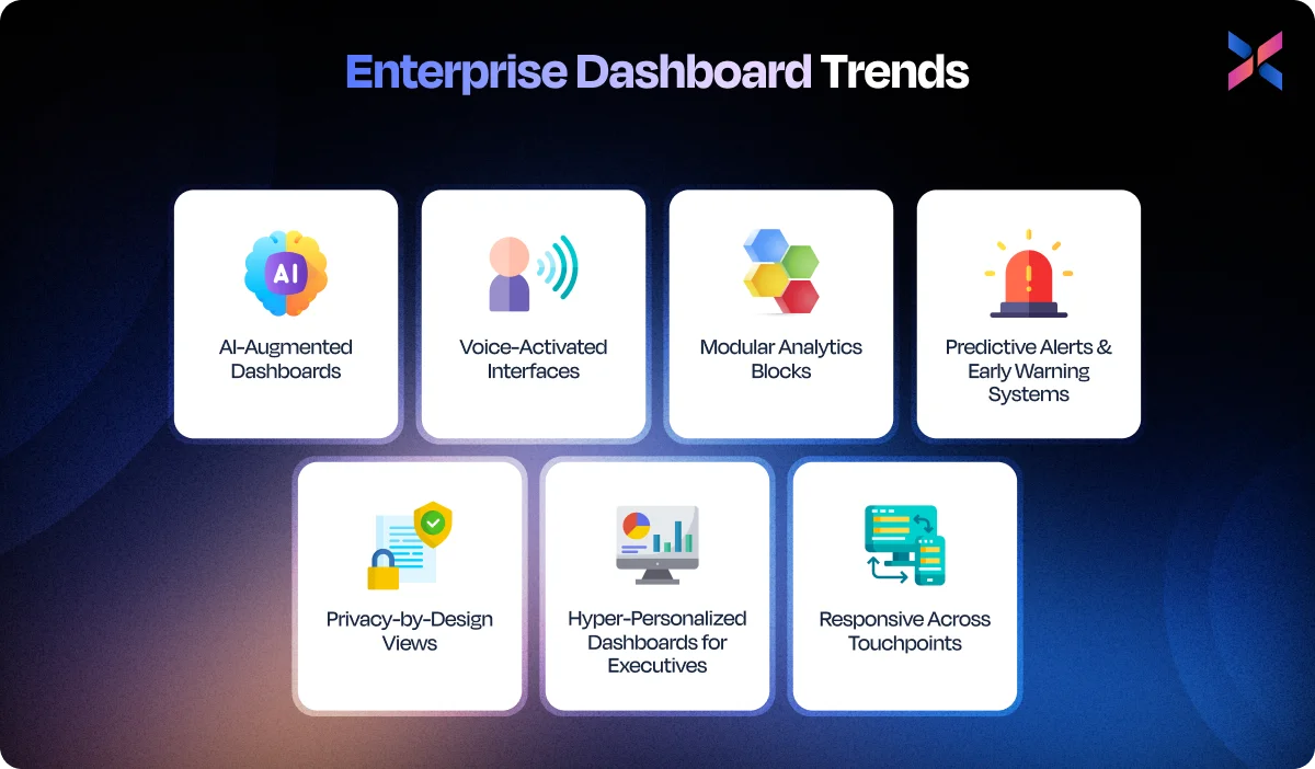
#1. AI-Augmented Dashboards
AI dashboards are no longer part of a hype trend; it has become the reality of design. Your users need insight into the underlying trends and opportunities without hiring a data scientist to their team.
With these dashboards, your users get the answers from the data without actually digging through it and interpreting it. Additionally, it helps users ask relevant questions that hold meaning for them.
AI can help add more layers of intelligence to your business as it predicts sales slumps and budget risks. With a tighter integration between BI and AI models, you will get better data narratives in 2025 that will improve personalization and decision-making.
#2. Voice-Activated Interfaces
Voice-activated interfaces allow you to interact with the dashboards with your voice. It uses natural language processing that makes it hands-free for queries. Your users will find this useful, especially when they need immediate assistance while on the go.
Voice-assisted interfaces become your data assistants that allow you to access the data and insights through mobile apps and smart speakers. For enterprises, a voice interface can reduce the barrier to entry that exists for non-technical users.
In the coming years, you will observe more interface designs with talk-back features that offer recommendations and clarifications.
#3. Modular Analytics Blocks
You need to think in modular analytics blocks that support role-specific customization. Your users can drag and drop components to create an interface for a specific role. For instance, they can add a subscription widget in case of marketing or a server uptime for IT.
With these blocks, you can ensure that the dashboard is flexible and scalable throughout the enterprise. Your users can easily assemble the views for the KPIs that are relevant to them without the development team’s intervention.
In 2025, you will find more of these DIY dashboard low-code tools with faster onboarding for better visibility and greater adoption across enterprises.
#4. Predictive Alerts & Early Warning Systems
Predictive analytics is equally important as your data can warn your users about what might happen. They are backed by ML algorithms that use past patterns to send out alerts before they cause major risks to the business. For instance, a spike in cart abandonment is one issue that can lead to major losses. By predicting this in the early stages, you can reduce the risks associated.
With this trend, industries like logistics, healthcare, and finance can take early action to prevent major losses. So, going forward, you will find more dashboards that enable “act now” tools and integrate them with Slack for quicker decisions.
#5. Privacy-by-Design Views
As data privacy regulations are getting increasingly strict, the dashboards need to adapt to the particular user browsing through them. When you incorporate privacy-by-design in your dashboard, your users can filter and edit sensitive data based on the user’s role and the clearance they have attained.
You can think of this design as an intelligent transparency that empowers the teams with data. It will also become a compliance-specific feature. Built-in audit trails and consent-aware widgets have become standards for enterprise dashboards.
#6. Hyper-Personalized Dashboards for Executives
Executives in enterprises won’t have the time to scroll through bloated dashboards. Hyper-personalized dashboards offer a 10-second snapshot that is customized to meet the user’s priorities. Whether you are planning for EBITDA shifts or incorporating market expansion metrics, you will get these aspects in the snapshot.
Using these views, along with AI-curated data, you can create a sleek UI that prioritizes strategy over operational insight.
You can expect dashboards to become executive inboxes that are driven by behaviour and role.
#7. Responsive Across Touchpoints (Web, Mobile, Smart Displays)
Your dashboard must be outdated if it only works on desktops. Modern enterprises are looking for multi-device solutions that can adapt across web, mobile, and smart displays.
Responsive design makes data accessible wherever you are. You can also expect adaptive layouts with gesture-based controls and screen-aware optimization to become standard for UI designs by 2025.
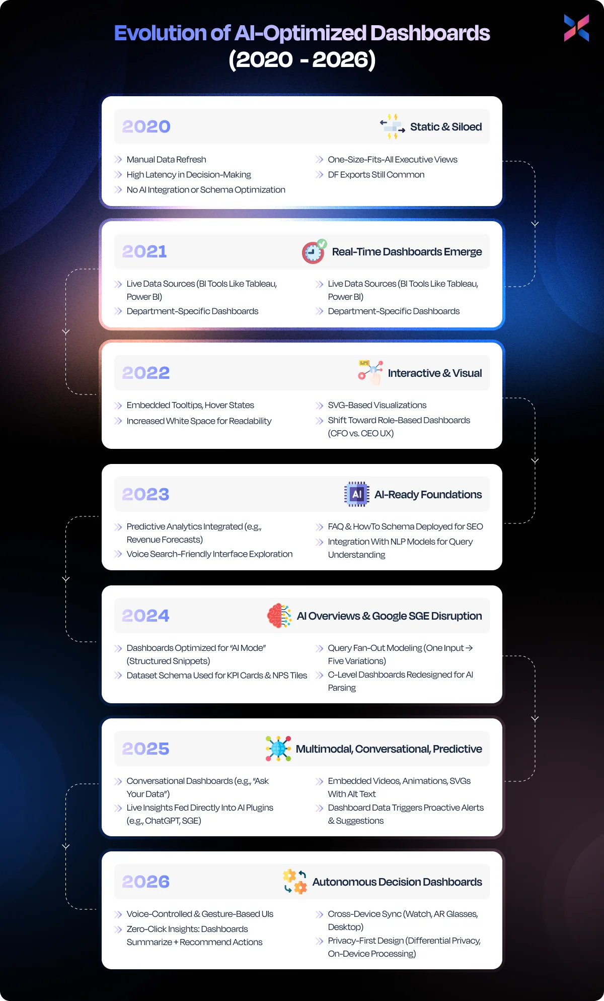
Evolution of AI-Optimized Dashboards from 2020 to 2026
Implementing These Lessons in Your Enterprise
A mindset shift is crucial if you want to implement these dashboard design lessons into your enterprise. You need to go from a static reporting model to dynamic and user-centric designs.
To get started, you must align your dashboard goals with key business objectives like the decisions to be made, the person who will make them, and the frequency. You should involve all the stakeholders in the early stages, like the CFOs, product leads, and operational heads. They will tailor KPIs to the user’s role.
Use modular design systems with AI-backed tools to personalize insights and scale the teams efficiently. Don’t overlook data governance as it helps with accuracy, consistency, and compliance. You should adopt a mobile-first and responsive design that can enable access to insights immediately.
It will help your users gather feedback, iterate, and enhance continuously to enhance the dashboard design. Whether you are from FinTech, healthcare, or the logistics industry, embedding these design best practices will deliver faster decisions with reduced cognitive load.
If you implement the design well, you will get more than reporting from the dashboard designs; they will transform the way enterprises see, think, and act on the data.
The Ultimate Best UI Dashboard Execution Roadmap
This practical guide will help you translate the dashboard theory into action. Use this step-by-step roadmap to build highly impactful dashboards to align them with real business needs.

#1. Assess Existing Dashboards
Begin this process by auditing the existing dashboards. Understand if the dashboard design meets real user needs. Check if the KPIs are relevant or outdated. Identify the bottlenecks, such as slow load time, cluttered layout, and low engagement.
This step will highlight what works for your business and what does not. It will help you prepare the foundation for a redesign. You should interview all the end users across departments to prioritize the features you aim to keep, improve, or remove. This transparent assessment will prevent you from wasting your efforts and set measurable benchmarks for the dashboard redesign.
#2. Define Executive KPIs & User Roles
A great dashboard is built on purpose. You should map the key user personas, like product managers or analysts, while aligning them with the KPIs that drive their decisions. You should avoid data dumping and define the metrics that the particular roles with its frequency.
This clarity will help design a focused, relevant, and usable dashboard. It can help create a personalized and engaging design.
#3. Prototype Iteratively with Real Data
You should build a live prototype with representative datasets instead of theoretical mockups. Build iterative designs using real data that can improve usability, layout decisions, and performance tuning.
Validate every version of the prototype with the end users to get feedback early and continuously. It can help reduce the need for rework and ensure that the final product is in sync with how your team uses data.
#4. Ensure Security & Role-Based Access
Data privacy with security should be embedded into the dashboard’s architecture. For this, you must implement granular access control for each role. For instance, the executives will see high-level summaries while analysts get a detailed breakdown.
You can keep the sensitive data protected to ensure the teams get what they need. Integrate the existing IAM systems with the dashboard for streamlined access.
#5. Integrate Data Sources Seamlessly
You should avoid using disconnected data silos that can kill the dashboards. You must use robust ETL tools or APIs that can help unify data from different sources like CRM, ERP, and cloud platforms.
Prioritize data normalization with consistency to avoid the garbage-in and garbage-out situations. You can attain data pipelines with confident decisions.
#6. Set Metrics for Ongoing Improvement
A dashboard is an ongoing process. You can use success metrics like user engagement, refresh rate, and decision turnaround time for the dashboard.
With these KPIs, you can determine the new requirements, plan updates and monitor the performance. With the feedback loops, you will ensure the dashboard stays aligned with evolving business needs.
Frequently Asked Questions
Q1: What are the best enterprise dashboard examples?
Ans: The best enterprise dashboard examples include FinTech forecasting centres, logistics and supply chain trackers, as well as healthcare staff load monitors. These are examples that showcase how it can be customized to meet real-time decision-making needs across industries.
Q2: How do business dashboards help C-level decision-making?
Ans: They provide relevant and role-based KPIs at a glance that empowers the executives with insights to identify risks, act on opportunities and act on them immediately without going through the reports.
Q3: What should be included in a financial or operational dashboard?
Ans: The key elements for the financial or operational dashboard include revenue trends, expenses, profit margins and cash flow that are customized by department and user roles.
Q4: What tools are used to build enterprise dashboards?
Ans: Popular tools like Power BI, Tableau, Looker and custom solutions with React and Angular help deliver advanced interactive platforms that are future-proof.
Q5: How do real-time dashboards improve business efficiency?
Ans: Real-time dashboards eliminate reporting delays, flag anomalies and offer immediate support towards informed decisions. It can increase agility while lowering downtime.
Q6: What is the cost to hire dedicated enterprise app experts from India?
Ans: The rate to hire a dedicated enterprise app developer from India ranges from $20 to $50 per hour. This depends on the experience, skillset, and project scope of the enterprise app.
Conclusion: Dashboards as Strategic Leadership Tools
Dashboards aren’t limited to data displays; they accelerate decision-making by shaping how the leaders think, act, and compete in the business landscape. As enterprises invest in user-centric and real-time dashboards, the C-level teams have the necessary data to respond faster and confidently.
Expert App Devs specializes in creating intuitive enterprise dashboard experiences across diverse industries like healthcare and logistics. With a UX-driven approach, we ensure that every screen delivers clarity and reduces clutter.
If you want to turn your metrics to impactful insights, connect with the team at Expert App Devs. Our designer will transform the executive dashboard for smarter and faster decisions.
 Jignen Pandya
